Defect #85
Data calculations for bar charts in stacked mode is wrong
100%
Description
Stacked bars are basically adding up, so if you have one bar with 3 series where the values are
20 (red), 30(green), 40(blue), you end up with 20 + 30 + 40 = 100 - which will display OK if your range is 0-100
Now when you change the minValue/maxValue (and the minRange/maxRange of the axis), these values starts from the minValue.
For example, if you set minValue to -20 (and maxValue to 120), with the same 20, 30, 40, you will have
-20 to 20 = 40 (red)
-20 to 30 = 50 (green)
-20 to 40 = 60 (blue)
--------------
total      150
So you will have a red part up to 40, a green bar from 40 to 90, and a blue bar from 90 to your maximum of 120.
Of course this is wrong, but knowing that the display is the same in google charts or eastwood clearly shows that the calculation at its source is to be tweaked.
This needs to be corrected in the charts4J API.
Files
History
Updated by Patrick Talbot almost 15 years ago
- Status changed from New to Resolved
- % Done changed from 0 to 100
VelocityReport v1.2.1 cleared the way: the scaling now works correctly, so, provided that you understand how stacking works and that you setup the right scales for the yAxis (minRange/maxRange) and the minValue/maxValue of the overall chart.
I will post here an example soon, but basically it now works fine!
Updated by Patrick Talbot almost 15 years ago
- File stackedExample.gif stackedExample.gif added
- Status changed from Resolved to Closed
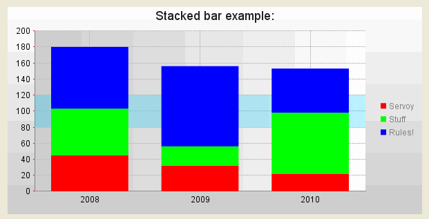
Following up on that, here's a working example (see capture attached for the result!)
// regular stuff:
var chartDef = {};
chartDef.titleColor = "#222222";
chartDef.titleSize = 18;
chartDef.background = {type: 'gradient', angle: 90, colors: [['#CCCCCC', 0], ['#FFFFFF', 100]]};
chartDef.width = 600;
chartDef.height = 300;
chartDef.areaFill = {type: 'gradient', angle: 0, colors: [['#CCCCCC', 0], ['#FFFFFF', 100]]};
chartDef.legendPosition = "right";
chartDef.legendMargins = {horizontal: 10, vertical: 2};
chartDef.margins = {top: 10, left: 10, right: 10, bottom: 10};
chartDef.grid = {xAxisStepSize: 10, yAxisStepSize: 10, lengthOfLineSegment: 3, lengthOfBlankSegment:2};
chartDef.title = "Stacked bar example:";
chartDef.threeD = false;
chartDef.horizontal = false;
chartDef.barWidth = 45;
chartDef.shadow = false;
chartDef.spaceBetweenGroupsOfBars = 15;
chartDef.spaceWithinGroupsOfBars = 3;
chartDef.transparency = 100;
chartDef.rangeMarkers = {orientation: 'h', color: '#00CCFF55', startPoint: 80, endPoint: 120};
chartDef.markers = [{shape: 'arrow', size: 10, color: '#FF0000', x: 40, y: 50},
            {text: 'Bad year!', size: 12, x: 44, y: 66}];

// here starts the interesting thing:

// set as stacked:
chartDef.stacked = true;

// set the values:
var data1 = {data: [45,32,22], color: '#FF0000', legend: 'Servoy'};
var data2 = {data: [58,24,76], color: '#00FF00', legend: 'Stuff'};
var data3 = {data: [77,100,55], color: '#0000FF', legend: 'Rules!'};
chartDef.bars = [data1, data2, data3];

// the sum of each bars by series will give (45+58+77=180, 32+24+100=156, 22+76+55=153)
// we give the chart a max value of 200 to let it breathe ;)
chartDef.maxValue = 200;

// a simple x axis with 3 values (note the scaling):
chartDef.xAxis = {
        labels: ['2008', '2009', '2010'],
        positions: [10, 20, 30],
        style: {textColor: '#000000', fontSize: 12, alignment: 'center', drawTickMarks: false},
        minRange: 0, maxRange: 40
    };

// and the y axis: the positions are scaled in a range of 0-100 anyway, so you can use [0,10...] or [0,20...] indiferently:
chartDef.yAxis = {
        labels: ['0','20', '40', '60', '80', '100', '120', '140', '160', '180', '200'],
        positions: [0, 10, 20, 30, 40, 50, 60, 70, 80, 90, 100],
        style: {textColor: '#000000', fontSize: 12, alignment: 'right', tickMarkLength: 12, tickMarkColor: '#FF0022'},
        minRange: 0, maxRange: 100
    };

// get the url
var chart = plugins.VelocityReport.getChart(CHART.BAR, chartDef, true, REPORT.RESOLUTION_LOW);

// display it in a HTML_AREA field:
html = '<html><body style="width: 100%; height: 100%; text-align: center; vertical-align: center">'+chart+'</body></html>';